Bar charts and histograms
Bar charts and histograms
Bar charts and histograms are both common data visualization techniques used to represent the distribution of data. While they have similarities, they differ in their application and the type of data they are used to display.
Bar chart:
A bar chart, also known as a bar graph, is used to display categorical data. It consists of rectangular bars, where the length of each bar represents the frequency or proportion of data falling into a particular category. The categories are typically represented on the x-axis, and the height or length of the bars corresponds to the values or counts associated with each category.
Key features of a bar chart include:
- Categorical data representation: Bar charts are suitable for representing discrete or categorical variables, such as different groups, categories, or labels.
- Comparison of categories: Bar charts allow for easy visual comparison of the values or frequencies across different categories.
- Bar orientation: The bars in a bar chart can be oriented vertically (column chart) or horizontally (bar chart), depending on the preference or the nature of the data being presented.
Example uses of bar charts include comparing sales figures across different product categories, visualizing survey responses for multiple options, or displaying population distribution across different age groups.
Histogram:
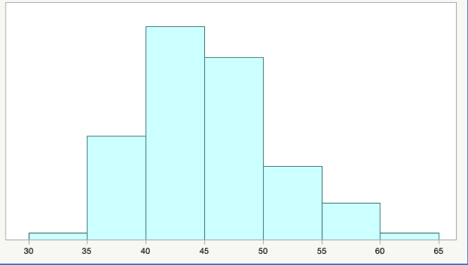
A histogram, on the other hand, is used to display the distribution of continuous or numerical data. It represents the frequencies or counts of data falling within specific intervals, known as bins or buckets. The x-axis represents the range of values, divided into intervals, while the y-axis represents the frequency or count of data points falling within each interval.
Key features of a histogram include:
- Continuous data representation: Histograms are suitable for displaying continuous or numerical variables, such as measurements, scores, or quantities.
- Distribution visualization: Histograms provide insights into the distribution of the data, including its shape, central tendency, and variability.
- Bin selection: The choice of bin size or interval width is important to accurately represent the data distribution. The number of bins determines the level of granularity in the histogram.
- Histograms are commonly used in fields such as statistics, data analysis, and quality control to understand the distribution of data and detect patterns or anomalies. They can reveal whether the data follows a normal distribution, is skewed, or exhibits other specific characteristics.
Both bar charts and histograms have their respective uses, depending on the type of data being represented. Bar charts are employed for categorical data, enabling easy comparison between different categories, while histograms are used to display the distribution of continuous data, providing insights into its shape and characteristics.


Comments
Post a Comment