Heatmaps
Heatmaps
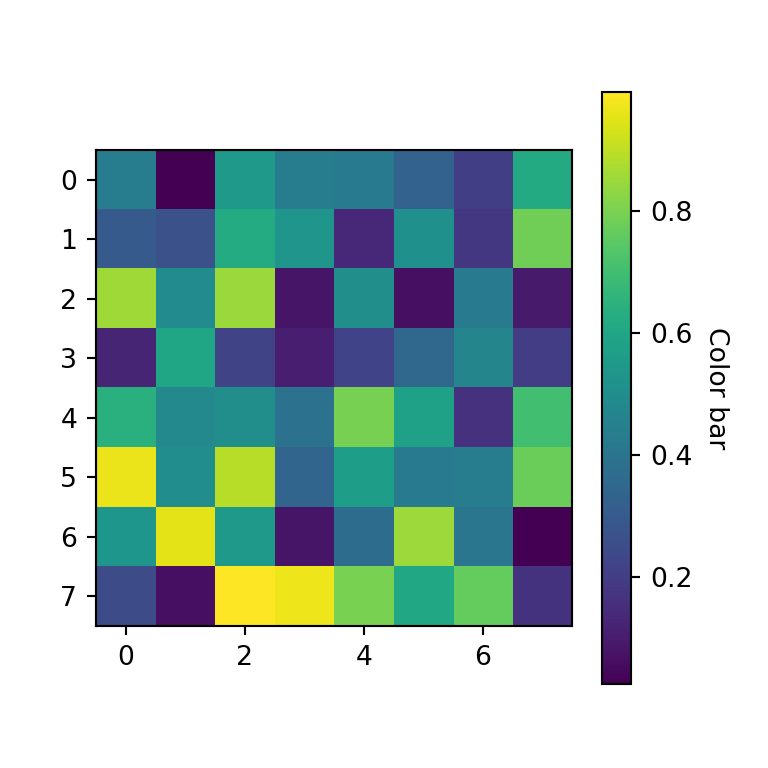
Heatmaps are data visualization tools that use color gradients to represent the magnitude or density of values in a two-dimensional matrix or table. They are particularly useful for displaying patterns, relationships, and variations in large datasets. Heatmaps provide an intuitive visual representation that allows for quick understanding and analysis of complex information.
Here are some key features and applications of heatmaps:
Color representation: Heatmaps use colors to represent the values in a matrix or table. Typically, a color gradient is used, ranging from a low-intensity color (e.g., light or cool colors like blue) to a high-intensity color (e.g., dark or warm colors like red). The intensity or hue of the color corresponds to the magnitude or density of the values being represented.
Matrix-based data representation: Heatmaps are well-suited for visualizing matrix-like data, where rows and columns represent variables or categories. The intersection of each row and column contains a value that is represented by the color in the heatmap. Heatmaps can display various types of data, including numerical values, percentages, or binary values (e.g., presence or absence).
Identification of patterns and relationships: Heatmaps help identify patterns, clusters, or trends in the data by visually examining the color distribution. Areas with similar or high values are represented by darker or more intense colors, indicating strong relationships or patterns. Conversely, areas with lower values or different colors indicate variations or differences in the data.
Highlighting correlations: Heatmaps can be used to display correlation matrices, where the values represent the strength and direction of correlations between variables. By using a color scale, positive and negative correlations can be easily identified. High positive correlations are represented by darker colors, while high negative correlations are represented by lighter colors or a different color palette.
Gene expression analysis: Heatmaps are commonly used in biology and genetics to analyze gene expression data. They allow researchers to visualize the expression levels of multiple genes across different conditions or samples. Heatmaps help identify gene clusters with similar expression patterns, providing insights into biological processes and relationships.
Time series analysis: Heatmaps can be used to represent time-based data, where rows or columns correspond to different time periods, and the color represents the values at each time point. This enables the visualization of temporal patterns, trends, or anomalies over time.
Hierarchical clustering: Heatmaps can be combined with hierarchical clustering algorithms to create dendrograms, which visually represent the clustering or grouping of variables or samples based on their similarity. This allows for the identification of clusters or subgroups within the data.
Heatmaps can be customized with additional features to improve their interpretability and usability. These include labeling rows and columns, adding color legends or scales, adjusting the color palette, and applying statistical transformations or normalization techniques to enhance data comparisons.
Heatmaps are widely used in various fields, including genomics, finance, marketing, and data analysis. They offer an effective way to explore and understand complex datasets by providing a visual summary of patterns, relationships, and variations in the data.

Comments
Post a Comment